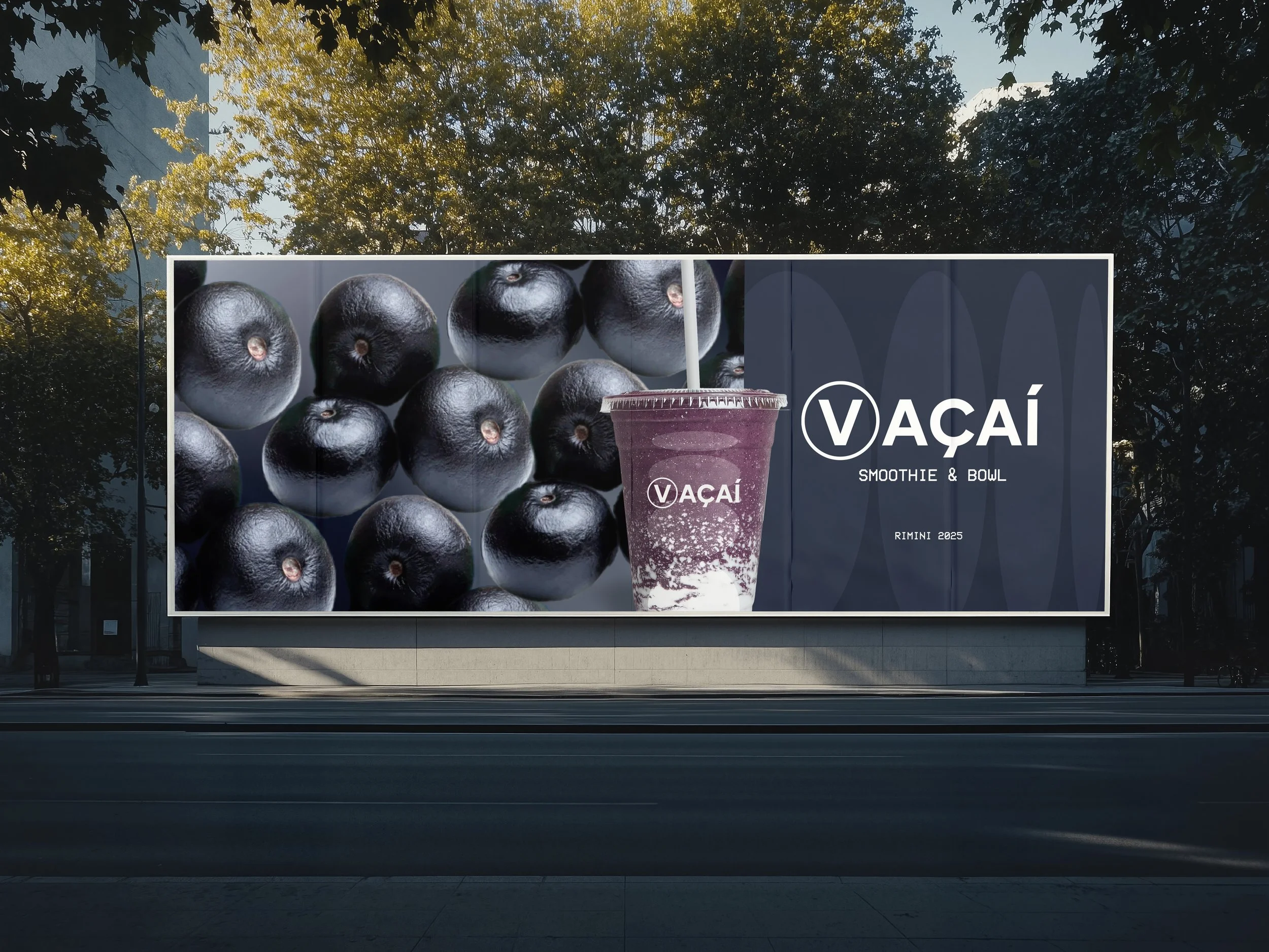
The collaboration with VAÇAÍ focused on the creation of a complete logo and brand identity system, designed to translate the brand’s positioning into a clear and scalable visual language.
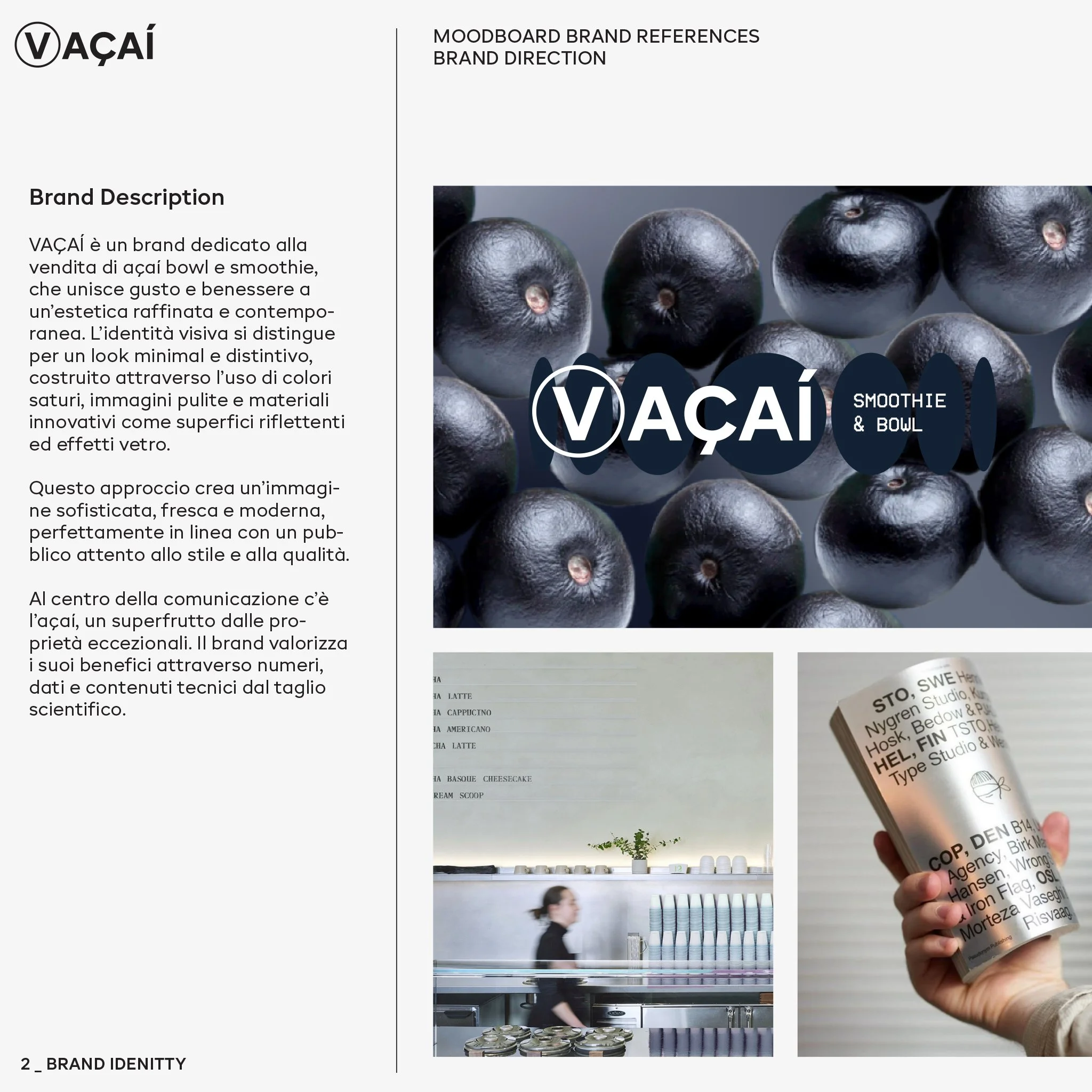
The identity expresses taste and wellbeing through a minimal and contemporary aesthetic, built on saturated colours, clean imagery and reflective or glass-effect materials. The result is a refined and modern image, aligned with a style-conscious audience.
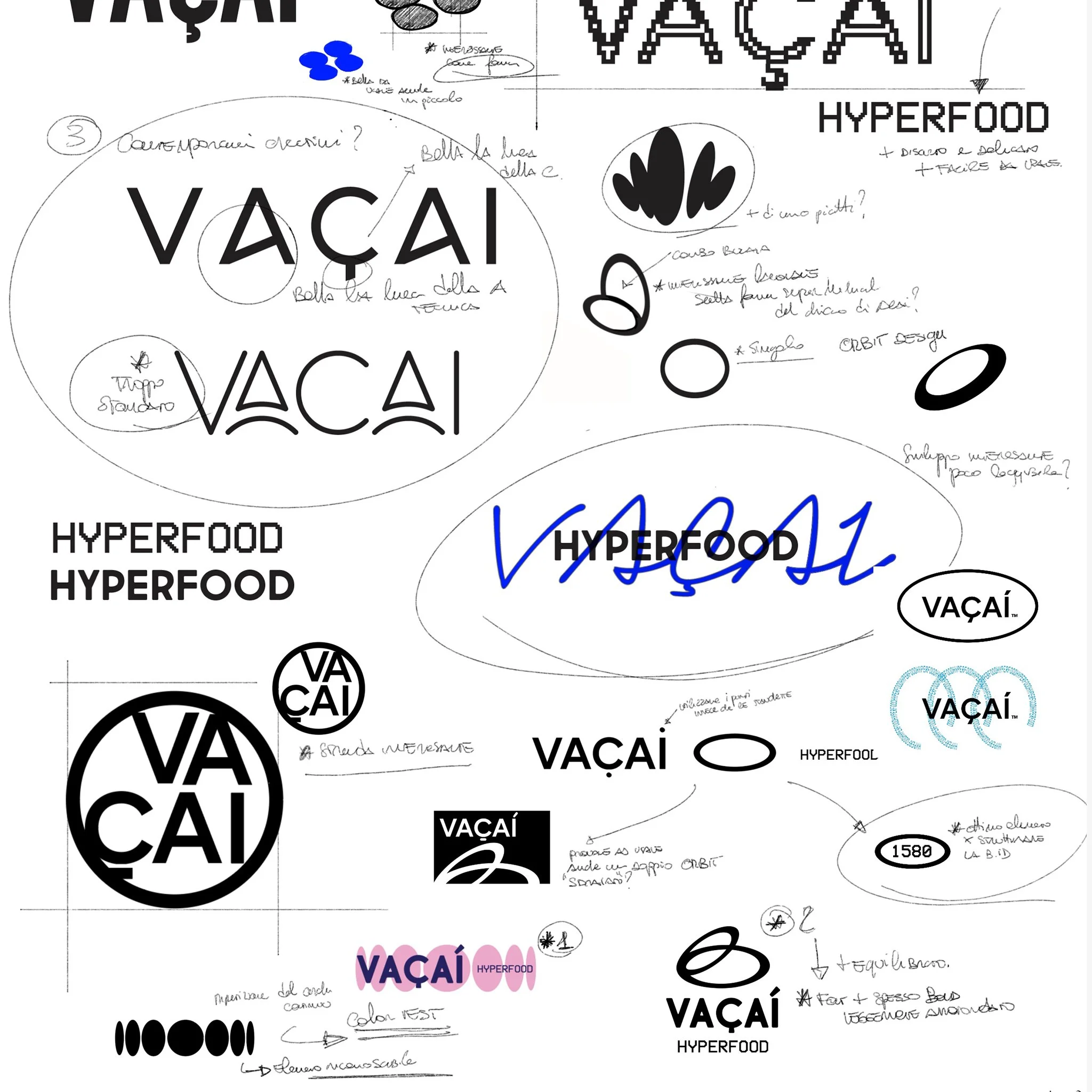
The logo development combined a modern sans-serif typeface with vector studies of the açaí berry. The fruit was simplified into geometric forms, then duplicated and distorted to generate a flexible visual system.
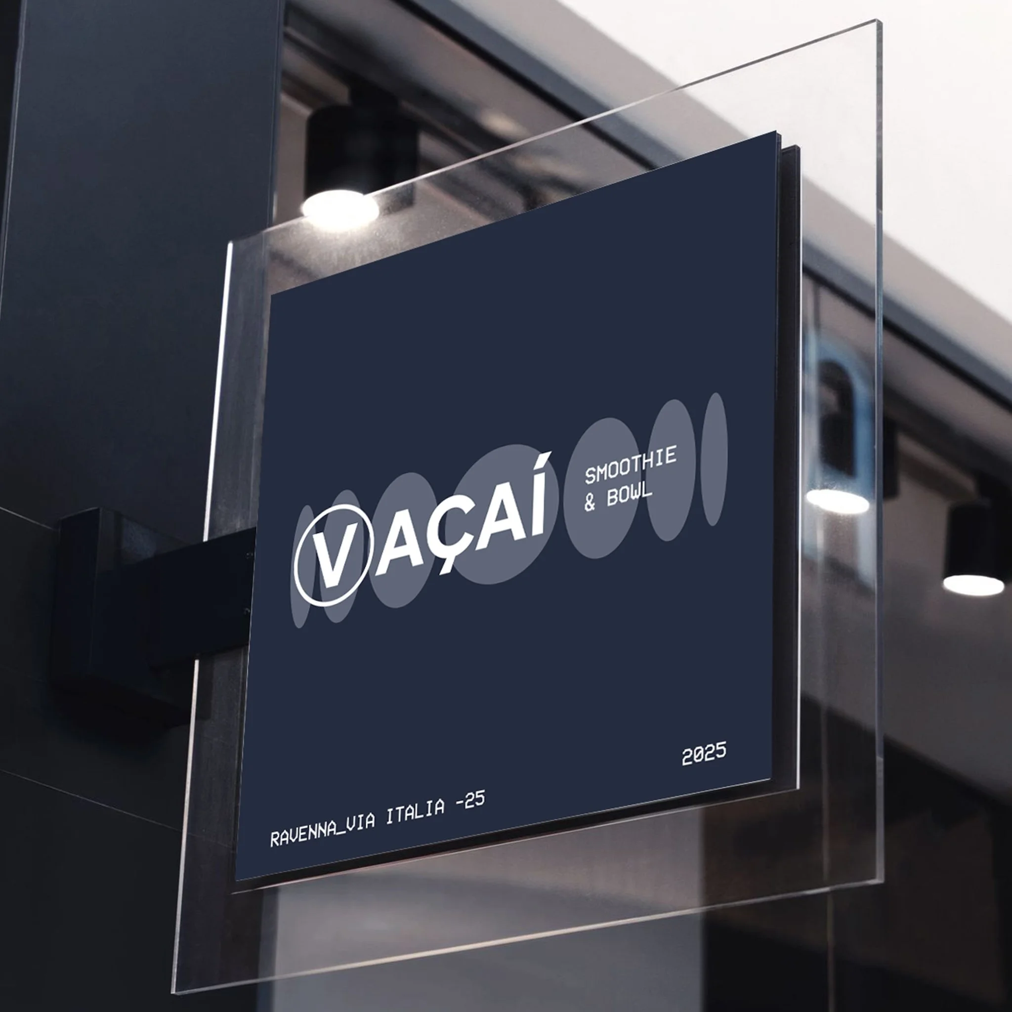
The VAÇAÍ logotype is structured through three elements:
– the graphic symbol
– the brand name
– the descriptor “SMOOTHIE & BOWL”
Development of VAÇAÍ’s logo and brand identity, translating taste and wellbeing into a refined visual system built on saturated colours.
Creation of a modular symbol inspired by the açaí berry, designed for packaging, patterns and digital applications with strong visual consistency.
In the primary version, the “V” is separated and enclosed in a circle, allowing it to function as an independent monogram while maintaining coherence with the overall system.
The graphic symbol acts as a dynamic visual asset rather than a traditional monogram. It originates from the simplified circular shape of the açaí berry, repeated and progressively distorted to create a symmetrical composition that communicates movement, energy and growth.
Thanks to its modular logic, the symbol can be adapted into patterns, digital animations and packaging applications, ensuring flexibility and strong brand recognition.
The project was completed with the definition of a cohesive colour system, layout guidelines and packaging applications, delivering a consistent and scalable brand identity framework.
Client: VAÇAÍ
Year: 2025
Category: Brand Identity Design